From research to rollout - building BIOV8’s digital healthcare hub
2024 – Ongoing
Client
BIOV8

”BIOV8 is a telehealth platform connecting patients with doctors, managing prescriptions, and delivering medications. I led the design of BIOV8’s web and mobile experience from the ground up — mapping key customer journeys, designing reusable UI systems, and collaborating with product, engineering, operations, and medical stakeholders to deliver an intuitive, scalable, and accessible solution.
Mapping & Designing Across Key Journeys
Stakeholder discovery sessions
To ensure our digital experience reflected patient needs, medical requirements and operational realities, I led a structured series of stakeholder discovery sessions with the executive team, medical team, operations staff and the member care team.
These sessions were broken into four key functional areas to capture deep insights from each stage of the service:
-
Registration & Onboarding: Account creation, medical questionnaire capture, and identity verification.
-
Repeat Prescription Ordering: Eligibility rules, review protocols, and order approval workflows.
-
Doctor Consultation & Requirements: Scheduling, tele-health integration, note-taking, and script generation.
-
Shipping & Delivery: Pharmacy dispatch processes, stock management, and delivery issue resolution.
Each session included representatives from multiple teams, creating a 360° view of how a patient journey connected to operational workflows. We used journey walkthroughs to map “as-is” processes, affinity mapping to surface recurring pain points, and impact mapping to prioritise issues by patient experience, regulatory compliance, and operational efficiency.
Example outcomes:
-
Identified doctor availability bottlenecks delaying prescriptions → Designed a repeat prescription pathway that allowed eligible patients to skip full consults, freeing up doctor capacity and speeding fulfilment.
-
Learned pharmacy dispatch times were fixed daily → Added cut-off time prompts at checkout to manage delivery expectations.
- Learned no shipping communications were in place → Installed Shippit Integration into both the website (short-term fix) and the web app
- Current scripts were uncompliant as members were not signing medical risk forms → Added this upon checkout on the patient dashboard
See example of Shippit integration plan

Shippit Documentation of go-live plan: https://brawny-elephant-e3b.notion.site/Shippit-Integration-1cd7b52dd7d180c7a338df0211f9b7ec?pvs=74
Journey Mapping & Branching Flows
From these workshops, I created service blueprints and end-to-end journey maps that showed the entire experience from both patient and doctor perspectives. These maps included:
-
Patient-facing actions in the web and mobile app.
-
Doctor actions within the clinician portal (e.g., script creation, notes, test ordering).
-
System communication prompts (SMS, email, in-app notifications).
-
Internal operational actions, revealing dependencies between squads and where delays could occur.
I then designed branching user flows to address distinct pathways:
-
New patients: Full registration, health questionnaire, and first consult booking.
-
Returning patients: Direct repeat prescription purchases without a consult (if clinically eligible).
-
Blood test flow: Patient receives results and is prompted to book a follow-up consultation to discuss findings.
The flows were modular and scalable, meaning each was built from interchangeable UI and logic blocks in Figma. For example:
-
The payment step could be dropped into any flow (consult booking, repeat order, or test result follow-up) without redesign.
-
Notification components were standardised so timing, tone, and triggers were consistent across all journeys.
-
Business rules (e.g., eligibility checks, wait periods) were embedded into the flow logic, making it easy to update across all affected journeys if regulations or treatment protocols changed.
This approach allowed us to adapt quickly to new treatments, changes in prescribing rules, or expanded service offerings without needing to re-map or rebuild entire journeys from scratch.

Impact
-
Enabled operations to forecast and staff more effectively by providing predictable demand patterns from mapped journeys.
-
Empowered member care teams to resolve queries faster using a single, shared source of truth for patient and order information.
-
Improved registration efficiency by introducing staged forms with conditional logic, so members only answered questions relevant to them — reducing drop-off and frustration.
-
Consolidated multiple disconnected apps into one integrated web app, creating a unified experience for patients, doctors, and internal teams.
Reduced shipping-related enquiries by 90% through the integration of Shippit, giving members real-time delivery tracking and proactive status updates (launched this to their current website).
Lean Research to Reduce UX Risk
Overview of work
Before committing to solutions, I implemented a lean research approach designed to validate ideas early, surface issues quickly, and minimise costly rework. This blended competitive benchmarking, real-world experimentation, and continuous feedback loops.
1. Competitive & Industry Benchmarking
I conducted detailed competitor audits of leading tele-health and prescription platforms including Juniper, Mosh, and others, to set benchmarks for simplicity, accessibility, and compliance.
-
This gave us reference points for best practices in onboarding, prescription flows, and repeat ordering.
-
I also documented UX pitfalls from competitors, ensuring we avoided similar friction points in BIOV8’s design.

2. Continuous Feedback Loops
I established direct feedback channels with our member care team and analysed 100+ Intercom support tickets, categorising recurring pain points such as prescription eligibility confusion, unclear renewal rules, and delivery delays.
-
This allowed us to proactively design solutions to high-frequency issues before they became launch blockers.
3. Real-World A/B Testing on the Current Platform
To validate new workflows before app development, I used Convertflow to implement proposed registration and ordering flows directly onto our existing Shopify site.
-
Ran A/B tests comparing approaches: immediate consult booking vs. program-first introduction, shorter forms vs. staged forms, and different CTA placements.
-
Used results to refine both copy and flow logic for the future web app.

By redesigning the registration form with staged inputs, conditional logic, and clearer progress indicators, we reduced cognitive load and eliminated irrelevant questions. Once implemented on the current platform, this resulted in a 23% increase in registration completion rates
4. Shopify Workflow Alignment to the App
We mirrored and tested key app workflows within Shopify to observe customer reactions, sales impact, and operational strain:
-
Registration form: replicated the proposed app form using Convertflow, running iterative A/B tests to find the highest conversion structure.
-
Product compliance: removed S4 (non-compliant) products and introduced TGA-compliant program bundles.
-
Repeat purchase workflow: allowed members to repurchase repeat prescriptions directly in Shopify once approved by a doctor, tracking uptake and completion rates.
5. Rapid Usability Testing
For each prototype iteration, I ran 5–7 rapid usability tests with members and internal stakeholders. This helped us:
-
Identify edge cases (e.g., eligibility rule misunderstandings, time zone issues for consult booking).
-
Refine copy, error handling, and UI patterns before committing to development.
Outcome
This lean testing framework allowed us to make evidence-driven trade-offs between business goals, user needs, and technical feasibility. By testing in low-cost environments first, we avoided expensive rework in the final app build and launched with proven flows that aligned to member expectations.
Repeats Example
The launch of the prescriptions workflow unlocked a significant new revenue stream by making repeat ordering seamless for eligible members. Built directly into the patient dashboard, the flow removed the need for a full consultation, streamlined payment, and provided clear prompts when prescriptions were ready for repurchase. As a result, repeat orders quickly gained traction, accounting for 40% of all sales post-release.
Documentation: https://brawny-elephant-e3b.notion.site/Repeats-Workflow-2107b52dd7d180afbbe7e8419cedaba2?pvs=74
UI of Repeats in Shopify

Creating UX Artefacts for Shared Understanding
With multiple squads working on different parts of the BIOV8 experience, from patient registration to prescription fulfilment, it was essential to create clear, living artefacts that kept everyone aligned on the vision, requirements, and dependencies.
Service Blueprints
I produced detailed service blueprints that overlaid:
-
Patient-facing actions in the web app.
-
Doctor actions within the clinician portal (e.g., reviewing cases, writing scripts).
-
Internal operational tasks for pharmacy and member care.
-
System events & communication prompts (emails, SMS, in-app notifications).
These blueprints became the single source of truth for understanding how front stage and backstage actions interacted, enabling each squad to see where their work impacted others.
End-to-End Journey Maps
I developed journey maps for key flows, such as:
-
New patient registration and first consultation.
-
Repeat prescription ordering.
-
Blood test ordering and follow-up booking.
Each map included emotional states, pain points, and opportunities, helping stakeholders prioritise where to focus design and development resources for maximum impact.

Branching User Flows
I created branching user flows that accounted for varied patient scenarios (new vs. returning, eligible for repeat vs. not, test results follow-up).
-
These flows were modular, built from reusable UI patterns and logic blocks in Figma.
-
Standardised steps (like payment, eligibility checks, consent forms) could be plugged into any journey without redesign, ensuring scalability.
Prototypes for Alignment & Testing
I built clickable, high-fidelity prototypes in Figma for both patient and doctor-facing experiences. These were used to:
-
Run usability tests and capture early feedback.
-
Give engineering teams clarity on expected interactions and microcopy.
-
Provide operations and support staff with a realistic preview of the user experience.
Documentation & Version Control
All artefacts were maintained in a central design repository linked to notion documentation, so:
-
Executive team could track scope and progress.
-
Engineers had access to the latest specifications.
-
Future designers could quickly understand the rationale behind design decisions.

Building a Scalable Design System
Given BIOV8’s tight budget and lean design–engineering team, I made the strategic decision to leverage Material UI (MUI) as the foundation for our design system. This allowed us to start with a robust, well-documented component library and then customise it to align with our brand, UX principles, and accessibility needs — saving significant design and development time.
Foundation Layer: Design Principles, Tokens & MUI Integration
-
Established design principles aligned with BIOV8’s brand and UX goals, simplicity, clarity, accessibility, and trust.
-
Mapped BIOV8’s colour palette, typography, spacing, and elevation into MUI’s theming system, creating a design token structure that ensured consistency across both web and mobile.
-
Modified MUI’s base components to match our visual identity e.g., updated button shapes, iconography, and input styles without losing the efficiency of MUI’s built-in responsive behaviour.

Modular, Reusable Components
Extended MUI’s library with custom components for BIOV8-specific needs, such as:
-
Prescription cards with eligibility logic built in.
-
Consultation booking modules with dynamic availability states.
-
Notification banners triggered by prescription expiry or shipping cut-offs.
-
Created atomic and organism-level components in Figma that mirrored MUI’s architecture, enabling a smooth design–dev translation.

Accessibility by Default
-
Leveraged MUI’s baked-in accessibility features, then layered in custom WCAG 2.1 adjustments, including improved colour contrast for our palette and ARIA labels for non-standard components.
-
Documented accessibility requirements in the design system to ensure compliance in every new feature.
Cross-Team Adoption
-
Ran developer onboarding sessions to walk through our customised MUI library, showing how to apply BIOV8 themes and when to use which variant.
-
Introduced design–engineering syncs before sprint planning to confirm component reuse and avoid duplicate builds.
Post MVP Plan
Designing BIOV8’s MVP was only the first step. From the outset, I set up processes to capture, organise, and prioritise post-launch enhancements so the product could evolve with member needs and business goals.
Structured Feedback Collection
-
Collated member feedback from usability tests, post-purchase surveys, and customer support channels (Intercom, email).
-
Analysed on-platform behavioural data using Hotjar heatmaps and session recordings to identify drop-off points, friction areas, and UI elements that members ignored or misunderstood.
-
Logged enhancement requests and recurring issues in a centralised backlog, tagged by journey stage and business impact.
-
Ran post-launch review workshops with operations, medical, and product teams to identify high-value improvements.
Prioritised Roadmap Initiatives
Using the feedback and backlog, we defined a post-MVP roadmap with initiatives that balanced user value, scalability, and commercial impact:
-
Unlocking additional health goals: expanding beyond the initial program set to cater to performance, longevity, and general wellness needs.
-
Adding TRT (Testosterone Replacement Therapy): introducing this as a regulated product, with its own eligibility flow and doctor oversight.
-
Subscription model: allowing members to opt into recurring deliveries for medications, reducing friction and improving adherence.
-
Native app with push notifications: building iOS/Android versions of BIOV8 to improve engagement, deliver timely health reminders, and send personalised treatment prompts.
Continuous Measurement
-
Set up analytics dashboards to track adoption of new features and identify drop-off points.
-
Introduced A/B testing plans for subscription pricing, notification triggers, and goal onboarding flows.
Explore More Work

Willed Designs
Willed Designs
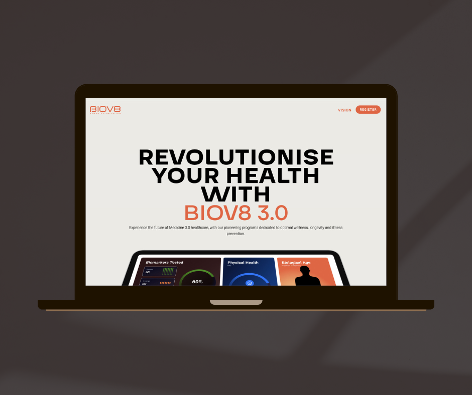
BIOV8 3.0 Landing Page
BIOV8 3.0 Landing Page
VBuild Construction